Get notified every time a new article comes out and
keep up with the latest plant care or plant trend.
Nothing brightens up a space quite like spring colors—but who says you can’t enjoy those cheery colors all year? By incorporating spring’s top trends and colors into your home décor, you can keep the bright and rejuvenating spirit of spring alive even in the darkest winter months. Of course, there’s no greater authority on what colors are going to be fashionable this spring season than Pantone, which recently released its 2016 spring report. With colors like “snorkel blue,” “buttercup” and “peach echo,” you’re bound to find design inspiration for decorating your home in these hues.
Here are six ways to decorate your home with this year’s top colors for spring.
This bright lime hue is a great complement to neutral colors, like grays and beiges. Try adding green accent pillows to your living room couch, incorporating bright green into your wall art or even consider going bold with an accent wall.
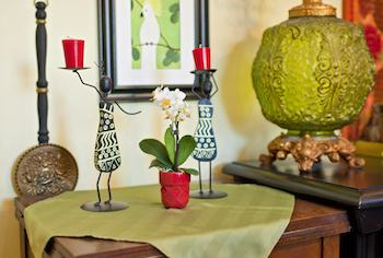
The strong and fierce tone of fiesta red is the perfect choice for a piece of statement furniture. A red couch or armchair can provide a bright focal point for an entire room. Complete the room with a fresh anthurium on a side table or a crisp white orchid as a centerpiece.
The tropical feel of snorkel blue can bring warmth and relaxation to your space with just a few key additions. This color works well as an accent or as a wall color, so the possibilities are endless. If you really want to incorporate a tropical element with this color, try adding a blue Watercolor Orchid™ to your mantle to tie in with your other snorkel blue design elements.
As one of the focal points of your home, your kitchen should be a bright and welcoming space. Buttercup not only acts as a great complement color to snorkel blue, but it can make your kitchen the happiest place in your home with just a few simple accent elements, like yellow dish towels, canisters or wall décor.
Though many of the top spring colors are bold, bright hues, pastels are proving their timeless appeal by capturing a few spots on the list. Both rose quartz and serenity were named 2016 colors of the year, demonstrating their relevance beyond just a single season. Both colors have the ability to add depth and intrigue to a space without straying too far from a neutral palette. Try rose quartz on your dining room walls or serenity as a relaxing paint color in your bedroom.
There’s a reason neutral colors never go out of style and this year’s most fashionable neutral is the earthy brown of iced coffee. This color can act as a unifying solid for furniture, rugs and wall colors, especially when paired with bolder accents like green flash and the soft teal of limpet shell.
However you choose to incorporate these top colors for spring into your home, you’ll be creating a space that is not only on par with the trends, but will also keep the spirit of spring alive all year.