Get notified every time a new article comes out and
keep up with the latest plant care or plant trend.
You may have heard that Pantone’s 2018 color of the year was Ultra Violet, but did you know that Pantone also released a color palette just for spring?
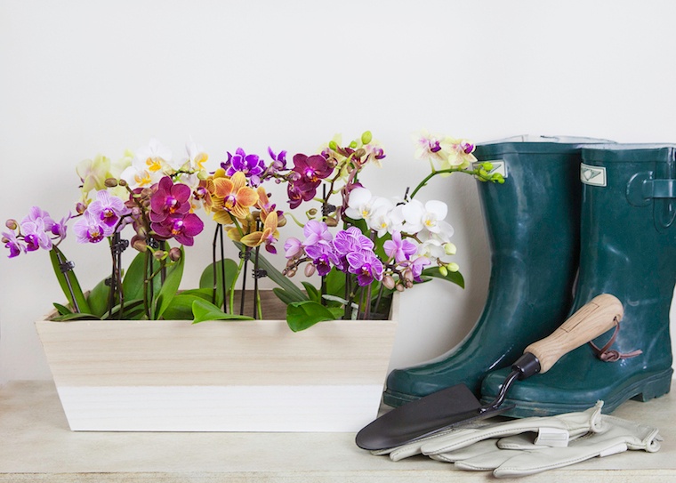
Fortunately, reinvigorating your living space with these new colors can be as easy as adding a few accent items and some potted plants. And there's no better symbol of spring than the orchid.
Here are some quick pointers for choosing the right orchid color to bring your home decor into harmony.
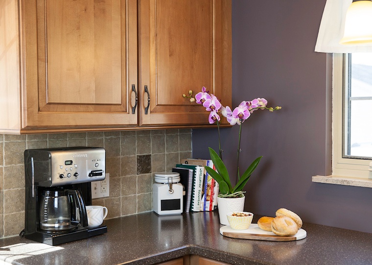
(Photo by Andrew Ridley on Unsplash)
This year's spring Pantone colors are bold, complex and playful. Alongside the color of the year, popular hues also include a bright shade of yellow called Meadowlark, a cool green called Arcadia, a blushing peachy-pink called Blooming Dahlia and a shade of sky blue called Little Boy Blue.
Pantone didn’t forget the neutrals either — there’s also pale Almost Mauve and chocolate-colored Emperador.
Find the color that speaks to you most and lead with that.
Each of the Pantone colors are meant to evoke an emotional response. For instance, if you want a room to be bright and cheery, you might look for new throw pillows or an accent rug that highlights Meadowlark. If you want your space to be more complex and contemplative, with an air of artistic brilliance, you might want to integrate Ultra Violet.
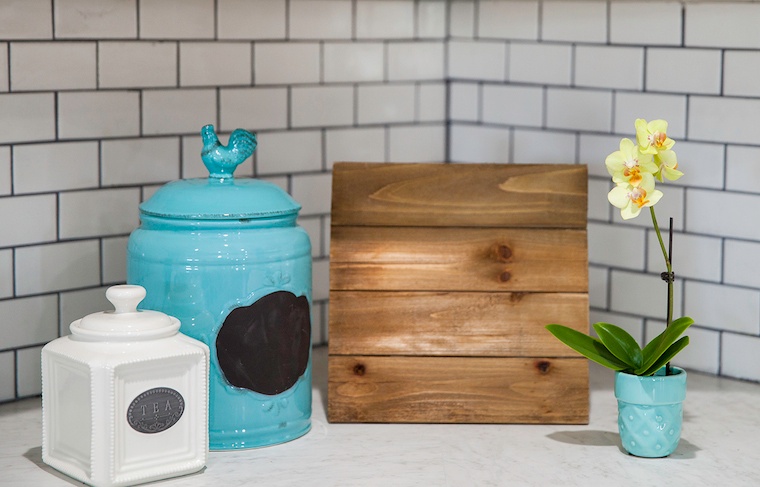
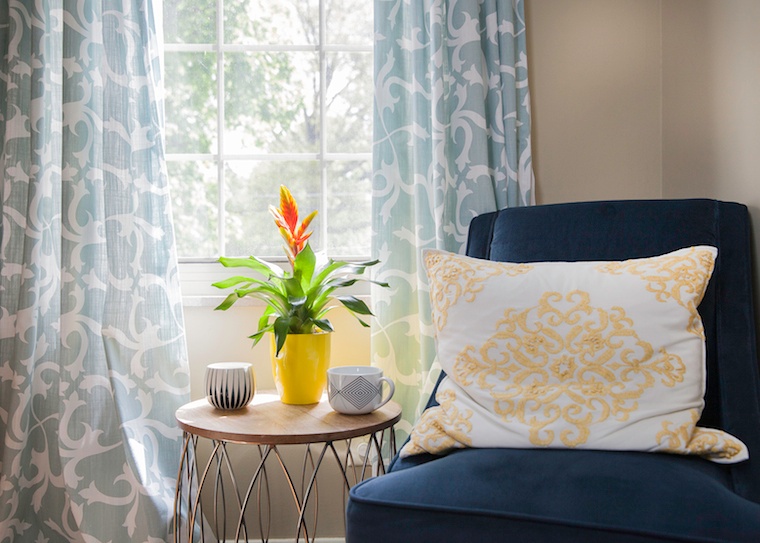
By choosing accent pieces in trendy colors, you can update your spring décor without overwhelming a small space. Think of it this way: you aren’t necessarily aiming to replace furniture, just the pieces that go on and around the furniture. Curtains, rugs, pillows, vases and wall art are all great additions that can make a room feel brand new.
Think about how you want to complement your new décor. Once you have your new colorful pieces in place, you want the rest of the room to play off of their hues. By adding complementary-colored plants — like Phalaenopsis orchids, which come in a variety of colors — you can even out the tone of a room in a way that is pleasing to the eye. For instance, if your new décor incorporates Little Boy Blue, you could offset with a bright pink or purple Phalaenopsis orchid.
Since this year’s spring décor trends are all about bright, bold colors, it’s important to consider how you’ll both “tone up” and “tone down” the color in your space. If you’re incorporating a lot of bright colors from this year’s spring palette, you may also want to have some neutral elements as contrast. For instance, a simple white orchid really stands out against a bright violet curtain and vice versa.
Remember, the key to updating your décor for any season is about more than finding accent pieces that are on trend — it’s also about finding pieces you love! Think about the feeling you want to create first, then look for pieces — and plants — that complement it.
Find more spring decorating inspiration in our new Spring Decor Lookbook!